Articles

Image: 'Universal Right Angle: Table001 - prototype'
rational-isation-ismy
The 'Universal right angle' is a nod to the economy of production within monolithic forms.
The replication of components within the customisation of individual products is the foundation of affordability. In this case, the base component is a length of 25mm by 25mm square steel bar cut to 350mm in length, multiplied by eight plus one.
TIG welding brings the components together in a configuration which is based primarily upon utility. The form is drawn directly from the 3 axis machining possibilities the structure now permits.
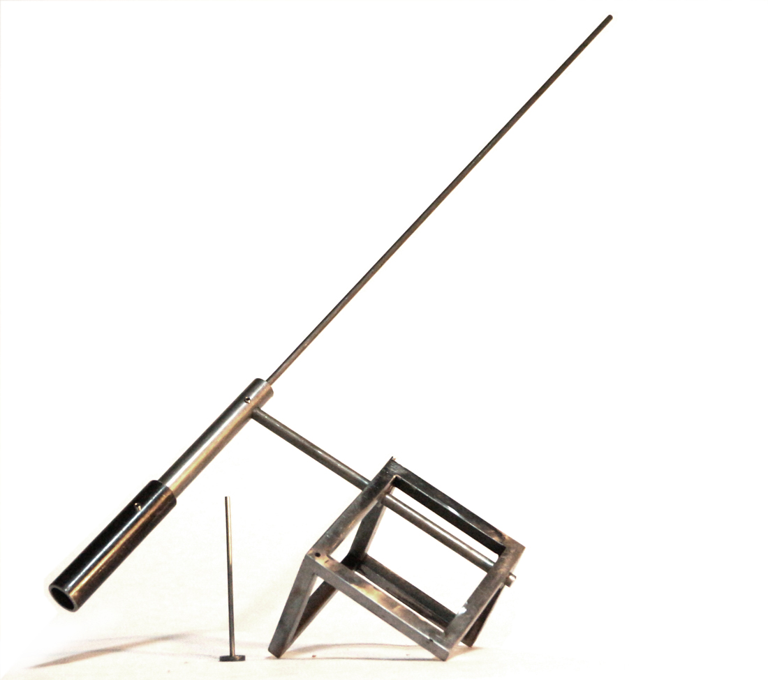
Above: Tripod model iteration - Scale model in steel
The base component stems from a cubic primitive rotated to make use of the tripod sides. These sides become the foundation for further iterations, whether they be aligned with a Y-up world or propped to touch the ground lightly.
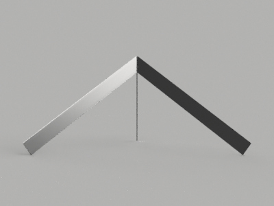
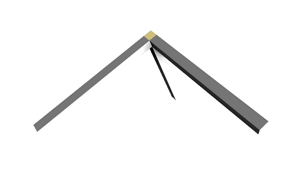
Above: Autodesk Fusion 360 model
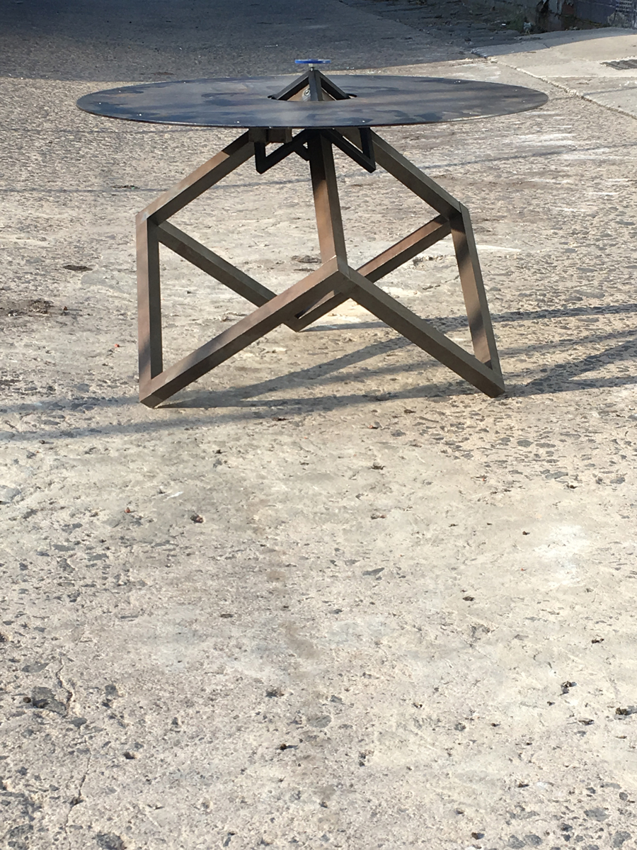
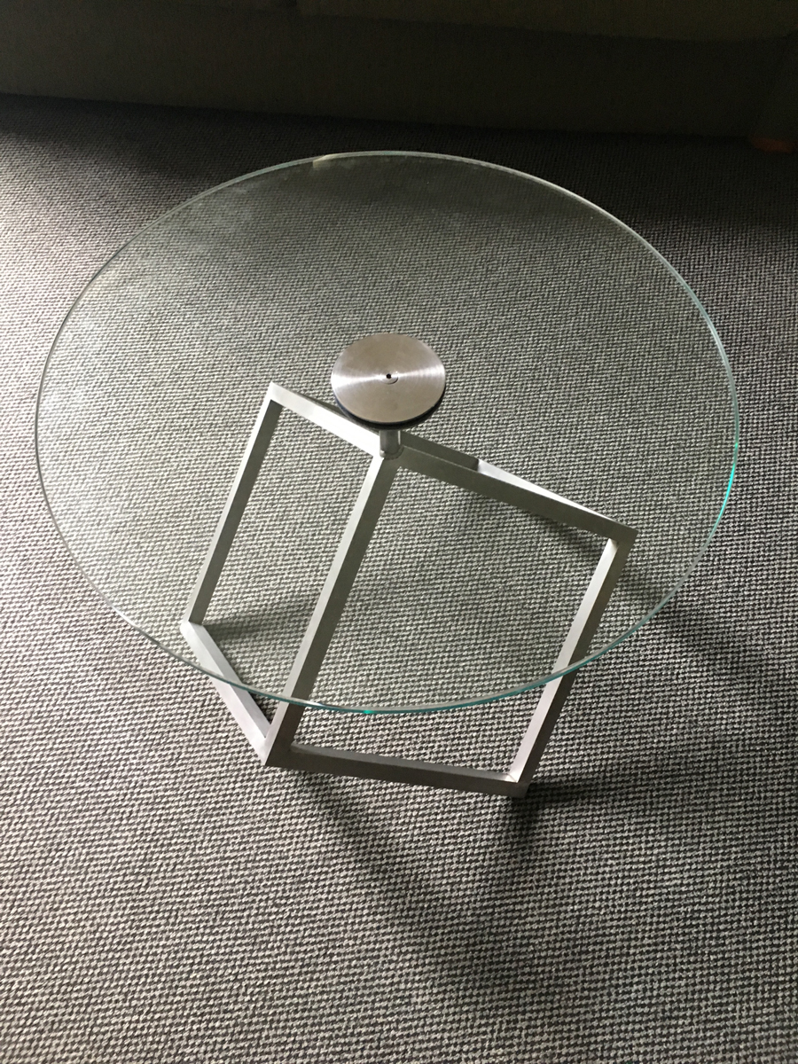
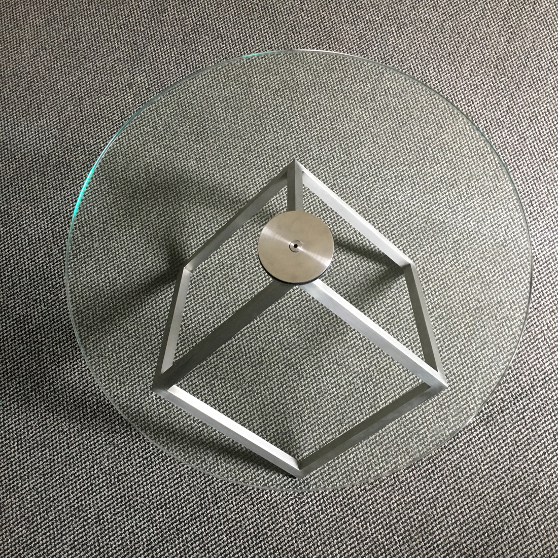
Universal Tripod Table: Steel chassis with glass table top
- Table top: 600mm diameter in clear 10mm toughened glass
- Base: Solid mild steel
- Height: 550mm
- Finish: brushed and waxed steel

Case Study: 'Star Voyager' Asteroids
The landing of 27 display modules
The phone rang insistently. It was Jan from RMIT...
'Hey guys, think you can help out with the design and construction of twenty seven asteroids?'
'Sure thing!' came the excited response from the design collaboration of Nick Johns from Black Panda Design and Rick Butcher of studioButcher design.
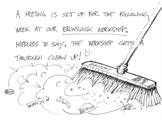
The big question - 'What vision does ACMI and the architects Minifie Van Schaik have for an asteroid?'
And so the discussion and negotiations rolled on, mixed with scale models, demonstration mock-ups of lighting, materials testing and design modifications around the theme of space travel.
The workshop was the setting for the vast majority of the development work while collaborating with the architects, proving concepts and ultimately building the twenty seven units.
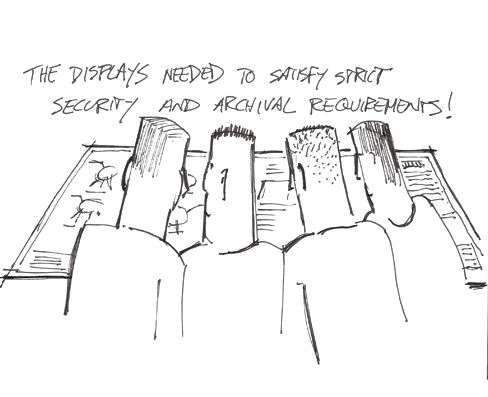
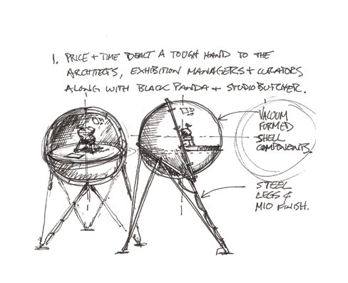
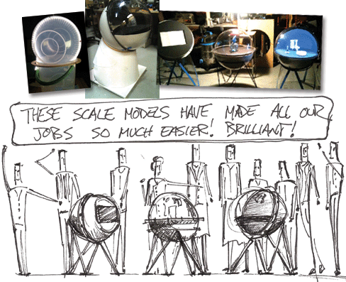
Mock-ups and prototypes delivered clear design solutions.
The assembly and installation of valuable exhibits from around the world dictated the module security and archival pre-requisites of the designs. Three distinct units were developed to provide a range of user interactions, from video displays to self illuminated curated displays.
The first mock-ups were produced at half size to demonstrate the lighting design, air and heat flow management, 'chewing gum deflector' solutions and overall aesthetics.
Soft Landing
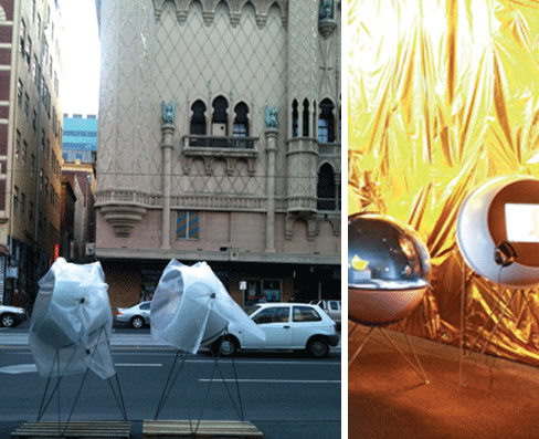
As promised, the twenty seven display units arrived at ACMI on time and on budget. The innovative yet super simple design solutions tailored to the project needs catered to the many requirements. The technicians and curators were given a design which was easy to manage and assemble, and easy to maintain.
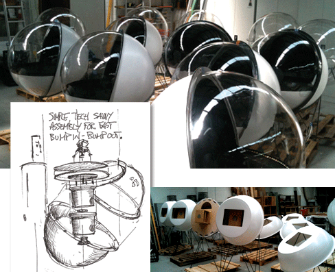
The skins were vacuum formed in Brunswick, Victoria by Vacform. The steel stands were fabricated at the Ovens Street workshops by Dave Murray and the lighting was specified and designed by Ovens Streets very own Bill Buckley.

Case Study: Architectural model 'illuminates community'
The Ruyton Girl School model keeps parents in the loop.
School infrastructure projects rely heavily upon the school community for support, funding and implementation. The Ruyton Girls School initiated their Junior School 'Centre for Creativity' project to address the ageing buildings on fronting Wellington Street in Kew.
The school decided to commission an educational model to display in the school yard every lunch hour for the preceding six months of the construction phase. The aim of the model display was to encourage buy-in from students and parents alike, and to attract additional funding sources for the project.
These goals dictated that the model should be interactive where possible, while at the same time being sturdy enough to withstand the daily onslought of young children and the school yard terrain.
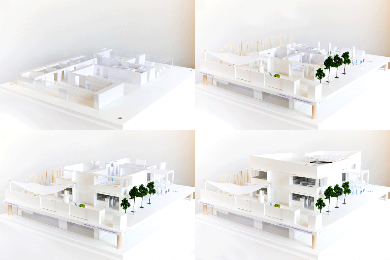
Ruyton Girls School Centre for Creativity model built by studioButcher and Black Panda Design.
Innovative Info-model gets the message across to all age groups.
The model has been split at each level and detailed to represent the interiors of all levels.
LED lighting was entificAmericaadded to the lower levels to represent the basement component of the build, and to illuminate the lower section to enhance the aura of those spaces within the model.
Ultimately the school and it's community moved in to a brand new building with the full knowledge of its layout, features and purpose. The lead up to the opening was also enhanced by the model and its supporting digital fly through and documentation.
The model was built in the Fitzroy workshops of Black Panda Design with the hands-on assistance of studioButcher. The model was built of paper lined MDF on oak staunchions. A transparent perspex cover was detailed to enable easy access to the model and it's removable levels.

Case Study: Friendly program 'enhances customer retention'
Service design drives motor group.
The development of multi-faceted customer retention initiatives has helped Berwick Motor Group deliver one of Australia's leading retail automotive businesses.
The first venture included the re-engineering of the CRM automated response program, run through Vital Software technology. We had established the key touch points, a series of events triggered by various customer interactions. The success of the program was highly reliant on the design and eventual engagement achieved to validate the services delivered.
The program was developed in-house at BMG where the culture of the business could be understood and maximised within the executions. The design for the collateral by studioButcher was built upon a point of difference and character clearly evident among the staff.
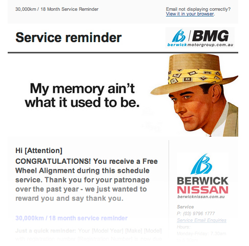
Automated email response design features quirky headers to maximise the local spirit and engage future relationships with brand positioning imagery of style and substance.
The wrangling of multiple factory style guides in the execution of group communications was critical in maintaining KPI's for each individual vehicle brand. This was particularly evident within press executions.
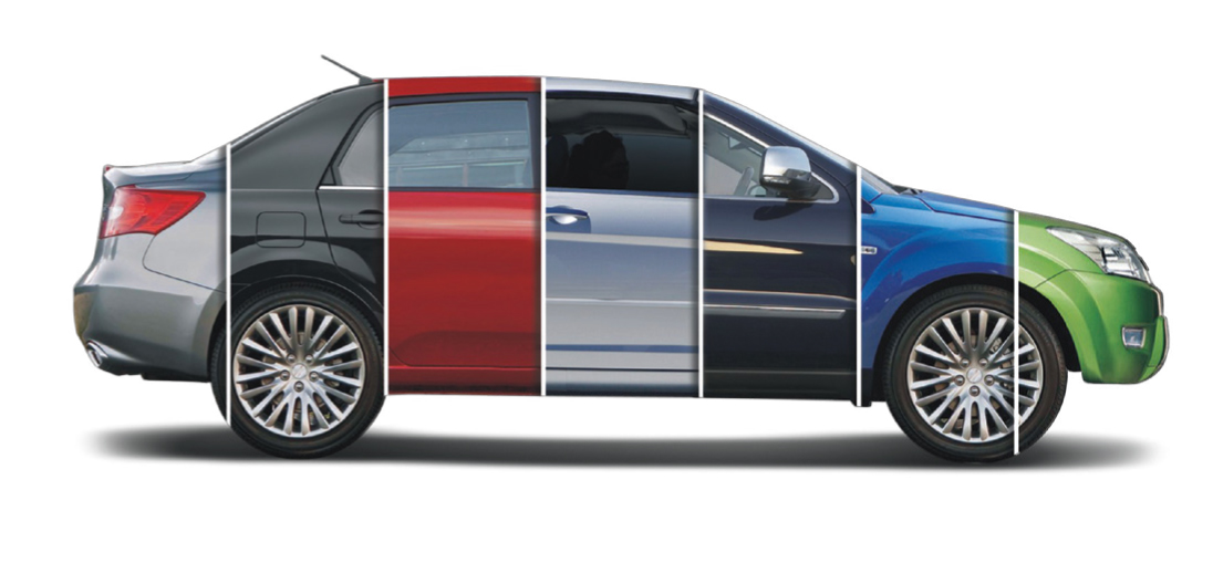
This multi-vehicle montage became the key identifier for the diverse group of popular vehicle brands.

The decision to formalise the name Berwick Motor Group triggered a re-brand of the umbrella business. The original 'Berwick B' executions (below) were retained as an important and recognisable component of the past identity.
Berwick logo, style and franchise iteration prior to re-design.
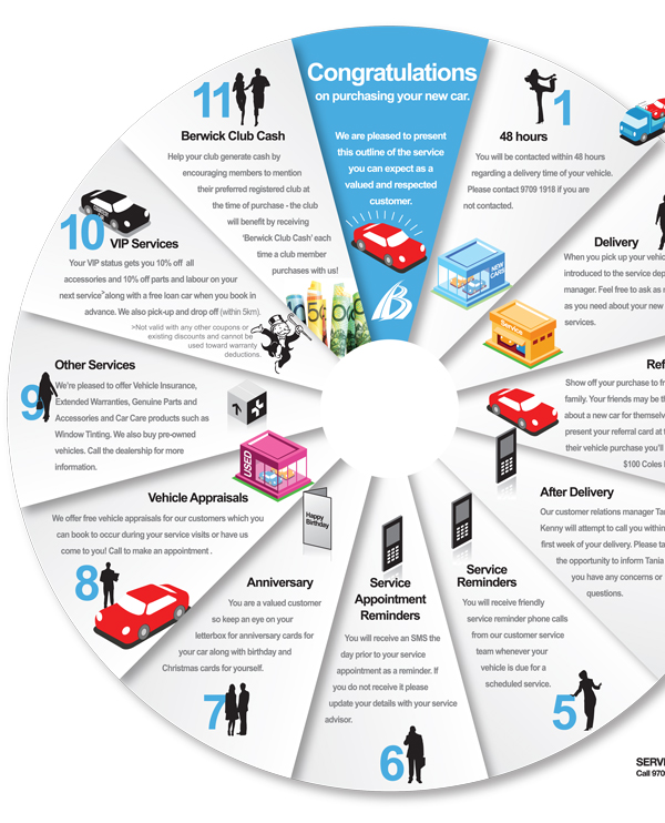
Life cycle 'wayfinding program' manages expectations.
When new customers turn up to pick up their new vehicle they're under no illusion that this is a big investment - definitely worthy of a decent introduction to the business they have just spent big bucks with. The 'Life cycle LP' (shown above) gives every customer a clear understanding of what they can expect from the dealership over the life of their vehicle ownership. No surprises equates to fewer disenfranchised customers, which equates to greater gross and more referrals.
This life cycle piece illustrates the value in good communication across the transaction landscape. The staff benefit by having a clear operational model to refer to. The customers see a business which is committed to customer service and innovation.

Case Study: Hosier Inc! 'encourages respect in the lane ways'
Project takes art to a new level in Hosier Lane as community unites to embrace street art.
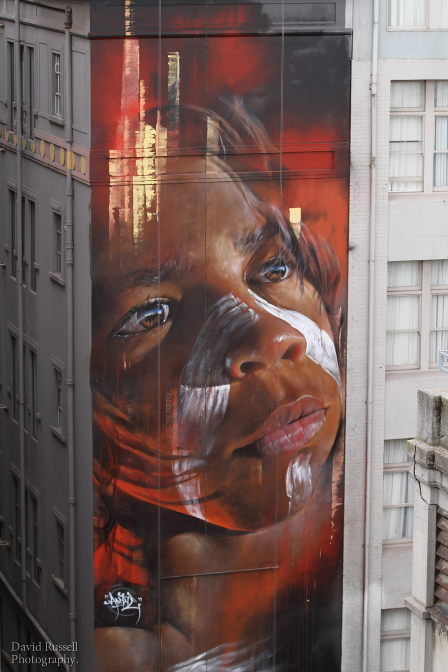
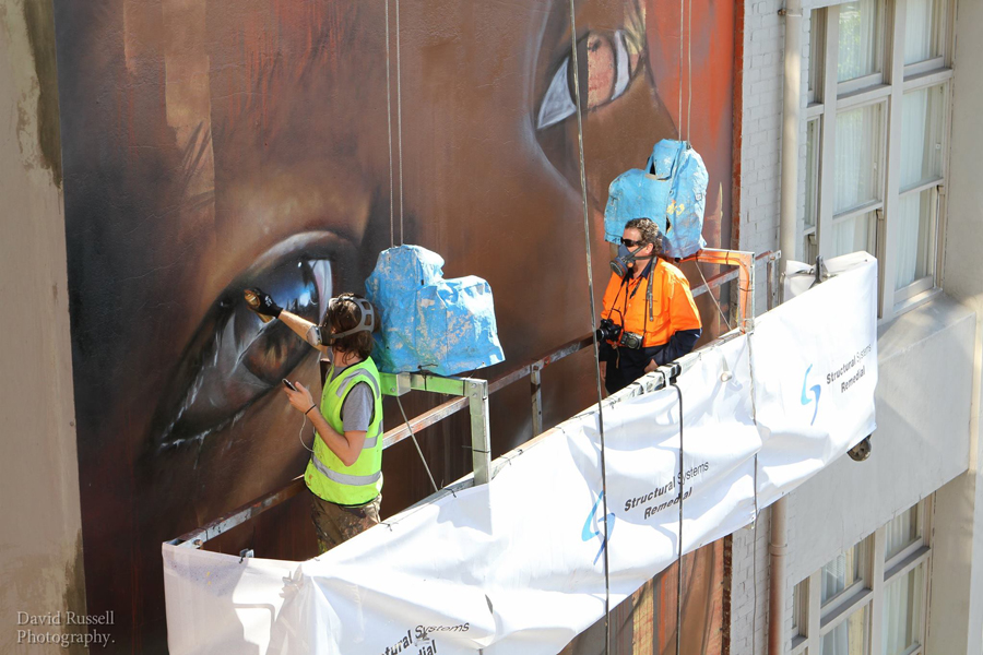
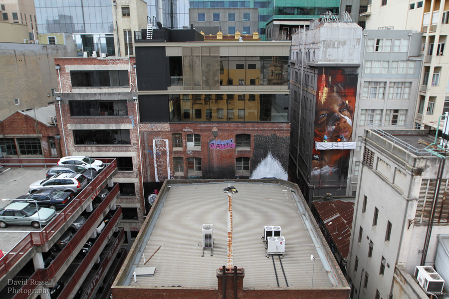
Photography courtesy of David Russell
Melbourne-based artist Adnate transformed Australia’s most iconic laneway over three days, painting a significant wall that has never before been available to any artist.
This was the first project to be commissioned by local community association Hosier Inc. Paint Up! is part of an ongoing program of activities designed to activate the laneways and create a safe and engaging environment for all to work, live, visit and enjoy the area. The City of Melbourne 2014 Arts Grant was developed for Hosier Inc! in collaboration with member residents, businesses and street artists.
The studioButcher office is situated on Hosier Lane so involvement in the amenity of the laneway has been a special interest of Richard and Kerry Butcher. An important component of the project has been the documentation of the work, including print by studioButcher, PR by Robyn Bunting, studioButcher and CoM, video by Michael Danischewski and stills photography by David Russell. The video below was commissioned as part of this documentation collateral.
Adnate above Rutledge Lane
Lord Mayor Robert Doyle said Paint Up! will add a new element to Melbourne’s favourite public street gallery. “The City of Melbourne continues to work with the Hosier Lane community to improve safety and preserve the precinct’s reputation as a leading street art destination. Paint Up! is an innovative project that will add to the colorful and eclectic Hosier Lane,” the Lord Mayor said.
Chair of Arts at City of Melbourne, Councillor Rohan Leppert said: “Melbourne’s street art is internationally renowned and an attraction for local and overseas visitors. Adnate’s work in Hosier will add to the incredible standard of work seen throughout the city.”
Hosier Inc is a not-for-profit association that formed in 2013 from a community-driven passion to address amenity issues by engaging art, culture and place. It aims to nurture the space with the help of all who have an interest in the area and want to take part. Members include residents and businesses, restaurants, artists, tourists, photographers and regular visitors.
“Everyone who loves and uses the lanes has a role to play in helping us maintain them, and they can all be a part of the association” said Luke McManus, Chair of Hosier Inc. “We see the art as a powerful instrument to activate the laneway in a positive manner – providing enhanced safety and unique experiences” he said.
Round one of Paint Up! has been delivered by well-known street artist Adnate on the rear wall of McDonald House. His proposal is a powerful representation of the beauty and strength of the Australian Indigenous culture, in the form of a portrait rendered with evocative strokes of vibrant earthly colour.
The subject of the piece is a local Wurundjeri, giving them the gift of stronger presence within Melbourne’s CBD, ever so close to significant sites such as Birrarung Marr. By choosing an indigenous child as his subject, Adnate hopes to embody the future – in his youth, the present – in his dramatic realistic presence and the past of the ancestors – in his eyes.
Site Collaboration
The PaintUp! submission which received the City of Melbourne Arts Grant centred on getting access to the taller walls around the lane ways. Logistically, this was always going to be the great challenge - finding ways to get access without blowing the modest budget.
Meanwhile, the owners corporation of 165 Flinders Lane had fortuitously been developing a maintenance programme which included the painting of the rear wall, so it was a stroke of luck for Hosier Inc to have at its disposal a swing stage hanging on one of the key walls of interest for the PaintUp! project.
Thanks to the accommodating and helpful management of the maintenance contractor Structural Systems Remedial, the opportunity to realize a key component of the project became reality. Getting access to the wall meant getting access to the building site, so a number of conditions of access needed to be addressed. Hosier Inc would need to ensure that Matt (Adnate) and any nominated assistants would need to be holding current white cards to satisfy OH&S requirements on site. In addition, they would need to be inducted onto the site and onto the swing stage.
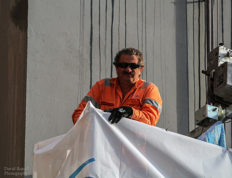
Weight restrictions applying to the swing stage capacity meant that there would be a limit of two people on the stage. This left Matt and Hosier Inc with a decision - would it be worth inducting an artist’s assistant onto the swing stage to replace the swing stage technician? In the end it was decided the most appropriate outcome would be to utilize the Structural Systems technician as an artists assistant. This meant Fernando, one of the two technicians on site would now be working in the company of Adnate on the stage. The arrangement proved to be a great outcome for both practitioners.
The Structural Systems team became key players in the realization of the artwork, and Matt received excellent building site support and experience from Fernando and Tony during the three days of painting. What's more, the project added excitement and profile to a business which is rarely in the limelight. Ultimately the project ran smoothly and without incident, thanks to a great collaborative endeavour. Many thanks go out to the Structural Systems Remedial team for their vision and assistance in accommodating this exciting project.
DVate above Rutledge Lane
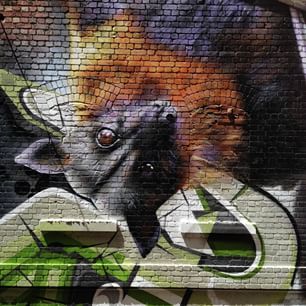
The second component of the Paint Up! project - PaintUp 2 - was completed in January 2015 by renowned Melbourne street artist Jimmy Beattie - featuring a fruit bat high above Rutledge Lane by DVate. Check out the video below.

Article: 'Wheel Spin Media'
Paging Mr Morrow... Mr Tom Morrow
Vehicles are peculiar. The smell of vinyl and plastics, the clunk of the door shutting - is it shut? Look for the handle, find a dark handle on a dark door lining, in the dark. Open and pull harder this time. Ignition key does a merry dance in search of the barrel like a piglet in search of a teat. Rattle it in the shaft and find a way to light up the dash. Warning lights and alarms sound a cacophony of beeps, bings and squawks. Do your belt up, shut the back door properly. Adjust the mirrors, adjust the seat, adjust the mirrors again. Sync the Bluetooth, hook up the phone charger, make a call, tune in the radio. Button down the window for some fresh air. Drizzle - wipers.
Eventually, eventually, the chance to plant the foot. Whether it's the Kingswood, the van, a bike, truck or even taking one's first train ride - it's a great to be out, traversing the transport network. Mastering this elaborate dance is the ticket to the world of relationships, nature, entertainment, commerce, endeavour - almost everything. It's a learned ritual, not so much a consequence of DNA. Great to be in control of one's destiny. Until that day in the big smoke when it all becomes clear that the transport network has you by the short and curlies. Congestion, parking, insurance, accidents, fuel, tolls, missed meetings! Looking forward to being summoned by a personal autonomous transport pod to get safely and quickly to town? It's where things are headed. We've actually been there before, with two thumbs up. Theme parks! Splash Mountain. The Tea Cups. Hay bale jaunts behind the tractor and the reliable old Ferris Wheel.
Back in 2008 Google called for ideas that would change the world through a project called 10^100. One of the five winning ideas turned out to be ‘Drive innovation in public transportation’. Geoff Barnett, the designer of the Shweeb monorail system attracted Google funding as a result of this initiative. He reasoned that “overhead cycle monorails connecting the city’s skyscrapers above the streets of Tokyo had to be a better solution than negotiating traffic jams or building even more roads and expressways.” The idea has been tested continuously as part of AgroVentures suite of adventure rides since 2007. It’s a fully functioning test bed of ideas being being put to the test daily by anyone in search of exhilarating new experiences.
The outliers of bias free ideas provide insight into alternative futures, transport mechanisms included. These might be found at the cinema, in fictional writing, at the Grand Prix or at the local farmer's market. The epic '2001 A Space Odyssey' penned by sci-fi author Arthur C. Clarke and director Stanley Kubrick was - and still is - hugely influential with it's stunning mix of design, science, technology and imagination. A future speckled with artificial intelligence, advanced communications, a great sound track and willful exploration. The GP wrestles in a similar vein with a future demonstrated in the present - engineering for the ultimate in performance and reliability - the chequered flag.
Transposing colourful stories on to real world scenarios is a challenge. Perceptions matter, no less for infrastructure proposals. Transport planning is coloured by the location and availability of pre-existing infrastructure - infrastructure bias. One would think this effect would be less pronounced in the development of green field installations. However, even these are naturally influenced by pre-existing markets, suppliers, performance characteristics, materials and software technology, maintenance and service capabilities. I suggest this accounts in part for such recursive green field housing developments, notwithstanding the occasional strategic development offering greater choice and diversity.
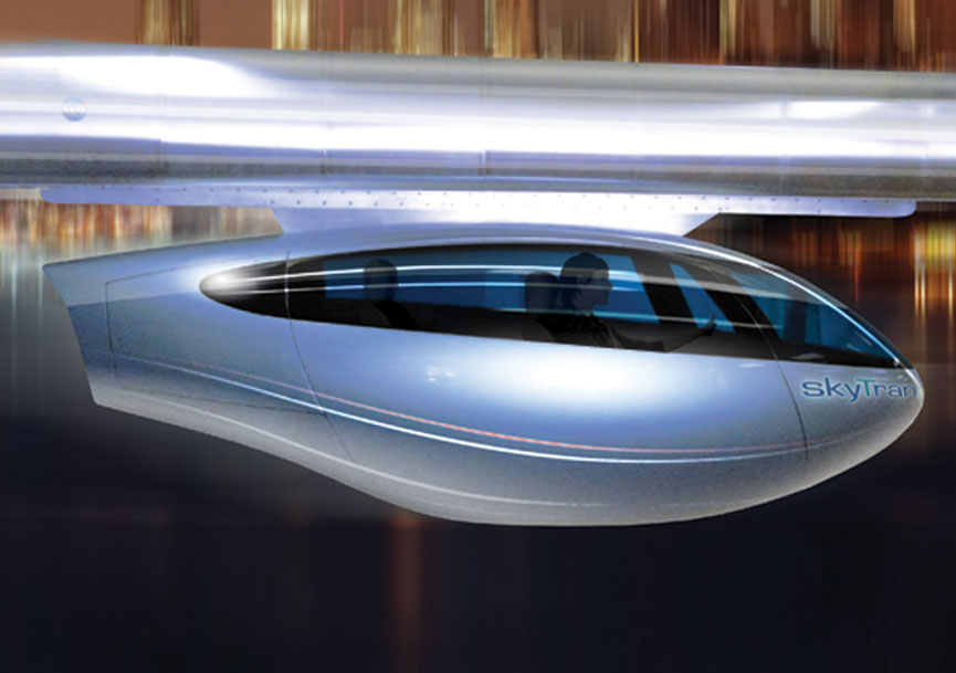
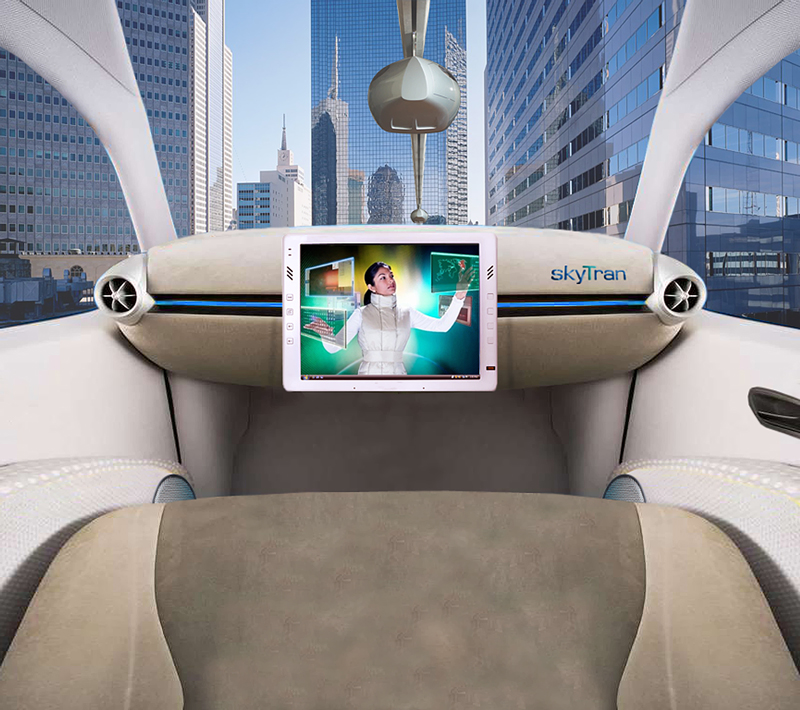
Images courtesy www.skytran.com
Disney's vision of a happy world by way of 'imagineering' illustrates one popular method for the implementation of new ideas. A stark contrast to the hyper performance of automotive racing, but for many the theme park holiday is still the most memorable journey they'll take. The durability of experience is a key factor in the delivery of any service. Indeed, the 'Imagineering' concept serves to fulfill many criteria around commercially driven ideation. It presents as a self regulated commercial infrastructure seeking a superior user experience for all the family. Safe but not boring. Built for mass consumption and generally integrating or implying futuristic technology, embellished by fiction, science and fantasy. Walt Disney articulated this vision in the "Experimental Prototype City (or Community) of Tomorrow". Known variously as the WEDWay 'PeopleMover', Tomorrowland Transit Authority, and Tomorrowland Transit Authority PeopleMover is still a popular attraction - as much for the leisurely pace of the ride as for the view from the elevated track.
Most cities promote an imagineered ride of some sort. Many boast a cultural icon posing as a transport device, such as the ferries on Sydney Harbour, the Central–Mid-Levels escalator and walkway system in Hong Kong, and the Shweeb at Rotorua. On the not-so-leisurely side of the coin, 'Colossos' is a the tallest wooden roller-coaster ride in the world, standing at 60m tall in Lower Saxony, Germany. Interestingly, it has been built from prefabricated laser cut sections to slot together like Lego to shorten construction time and lower costs. When it comes to speed, no ride outdoes the 'Ferrari World' ride in Abu Dhabi called 'Formula Rossa'. To get to a top speed of 240km/h in around 5 seconds flat it is launched with the aid of hydraulics to generate an unholy G-force on a track that inspires new faith in the beauty of structure.
Intamin Worldwide is the designing and manufacturing company responsible for building 'Colossos' and 'Ferrari World'. Based in Wollerau, Switzerland, they not only build roller coaster rides, but also a range of public transit systems as a ‘Transportation’ segment. So already there are structural business links between fun and transportation.
.jpg)
Images courtesy Intamin Amusement Rides
What would it be to have 'Space Mountain' built around your local train station? As one of the most popular attractions among the Disney rides, this classic space technology roller-coaster ride keeps theme parkers coming back again and again. Transposing this methodology to a transit network, what might a roller-coaster ride from railway stations directly to school yards do? Help keep children (and parents) off dangerous roads. Minimise road sharing with commercial traffic. Maximise mode separation. Expose our future leaders to an imagineering experience! Heightened by learning, laughing and sharing. Engaging mobility as an appropriate experience. Autonomous pods rolling and coasting off the mountain. As much journey as destination.
Extrapolating further on Disney diversity, how might these classic rides integrate into a mobility experience? (Apologies to those not familiar with these themes)
- Indiana Jones Adventure
- Splash Mountain
- Star Tours
- Pirates of the Caribbean
- It’s a small world
So there's a pattern emerging. Public infrastructure renewal is hard to imagine. Developing appropriate visions is hard. Ecosystems are complicated. Accepting that no one idea will ever embrace the spirit of millions of individuals with their specific needs and wants. But it's thanks to fiction, movies, parks and play that we can start to visualize what it is we've been trying to articulate for so long.
Many of the questions around design and engineering have been answered already in one way or another around the globe, either by story tellers, movie makers, extreme adventurers and entrepreneurs. The most difficult question though - who's paying? I look at the elevated pod design from 'SkyTran' above and see a vehicle which could easily sit in a showroom next to any sports car. Simply another transport mode choice. Hook up to the overhead at the dealership and fly away! Private transport on a public track infrastructure. Not too different to owning and operating a car and a boat, each offering a particular escape. And the opportunity to customise means the future is personal, even blue-printed for the thrill seekers among us.
Article: 'Wheel Spin Media'
Channelling Concurrency
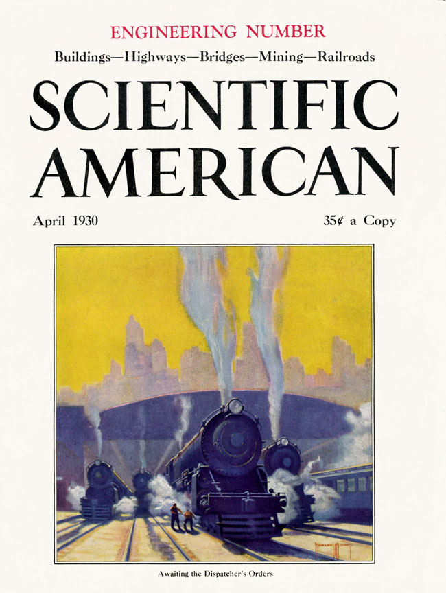
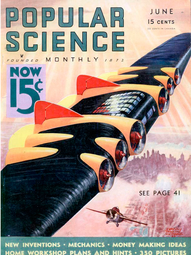
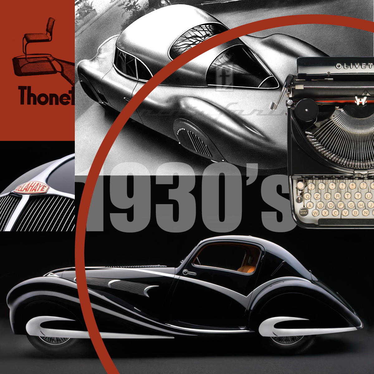
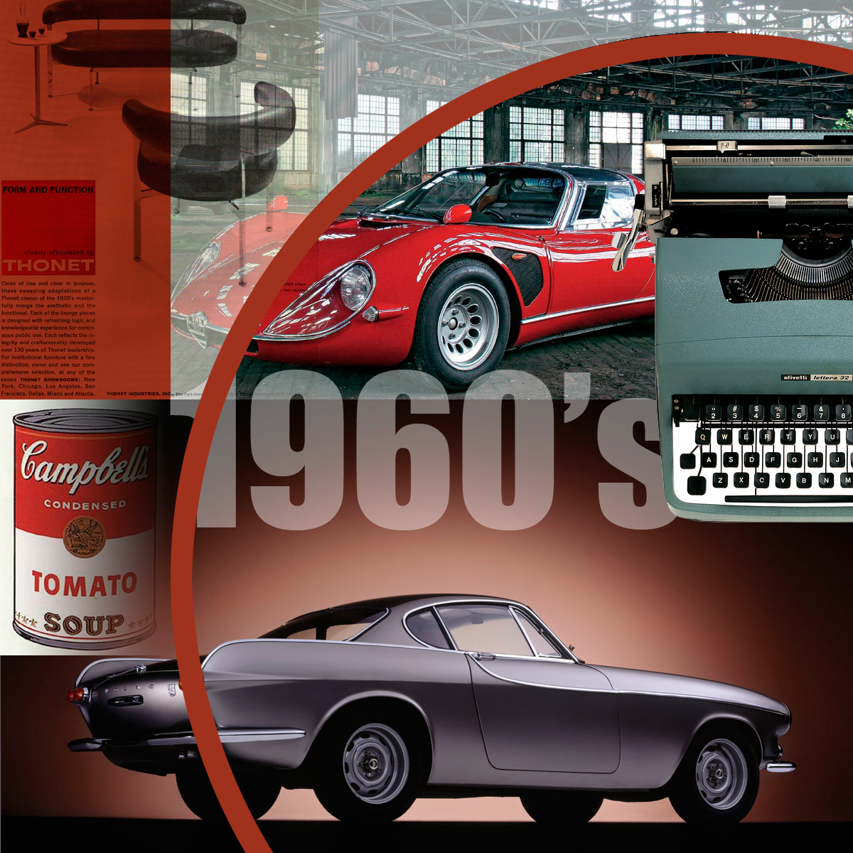
Photomontage snapshots representing artefacts developed around the same time.
Our made environment evolves continuously. However, experience and reality are not entirely linear. Thinking about where we're headed is well informed by a history which persistently repeats itself - over and over again. This brief look back has also uncovered what I'm calling a channelling of concurrency. That is, the influence of one development on another at similar times in history.
Vehicles, furniture and communications
Who and what have influenced my design and lifestyle choices? The images here serve as a scratch-the-surface tour through some of my favourites. In the format of photographic collage they're an adhoc view of a few influences on design. The comparison of forms and functions found on the objects around us can be instructive, particularly when most if not all of those objects have a major influence on the quality of our lives.
Looking back is a valuable contextual reminder that society is directed entirely by the thinking and developments of the past. Nothing is new without the old. This tiny peek into the past celebrates the regular knit of evolutionary development over time and space - and even emotion. It's clear that the discussions around transport and infrastructure were just as prevalent then as they are now. Occassionally the predictions are prescient. We can be sure that the debate and experimentation will continue ad infintum.
What trends or myths influenced what, which came first, and why did these ideas become so influential.
Images: 1967 Alfa Romeo Tipo 33 Stradale, 1937-Pininfarina-Lancia-Aprilia-Berlinetta-Aerodinamica
